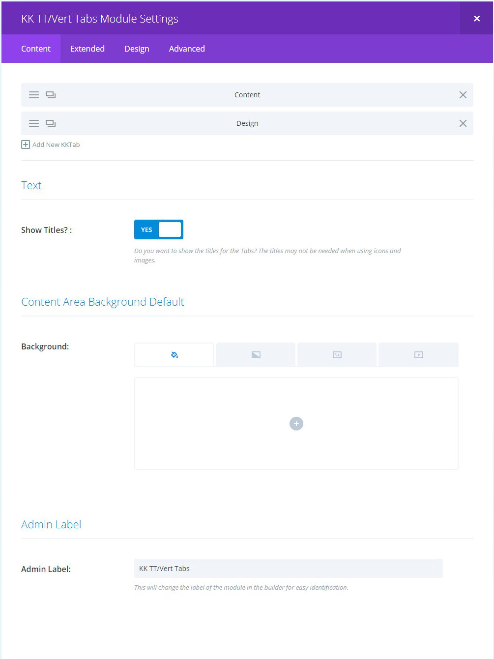
BACKGROUND: this is the default background control for all tab content.
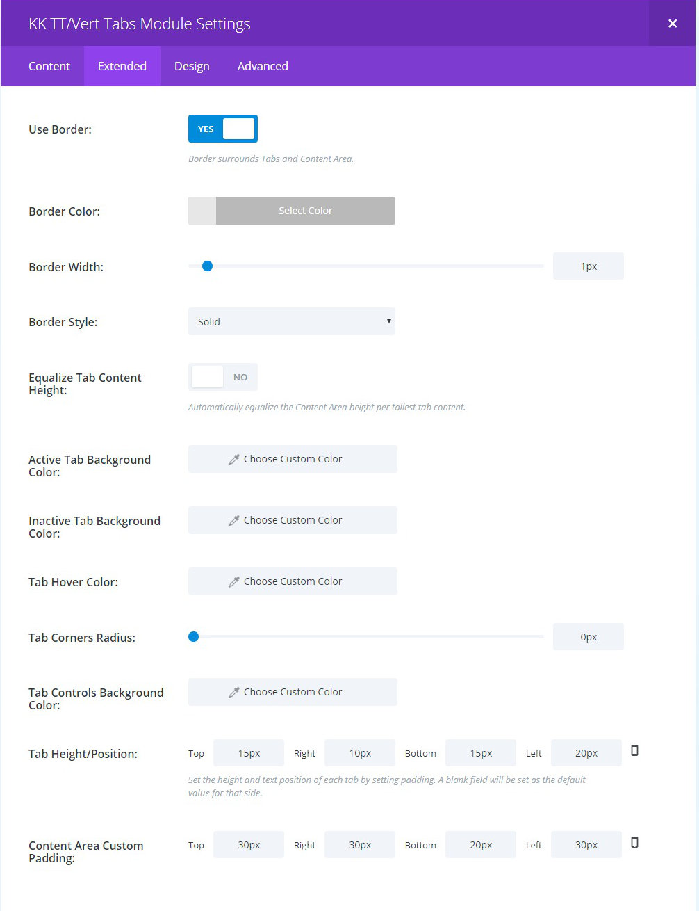
EQUALIZE TAB CONTENT HEIGHT: toggle to make all content areas the same height. This is useful, among other possibilities, to make sure the content area has greater height than the Tab area.
BACKGROUND/HOVER: background settings for Active and Inactive tabs as well as Hover. All are optional. The plugin stylesheet has default background color settings.
TAB CORNERS RADIUS: optionally set a radius for the outer corners of every Tab.
TAB CONTROLS BACKGROUND COLOR: optionally change the background color of the full Tabs column. Use the control to also make this area transparent.
TAB HEIGHT/POSITION: set the CSS padding for the four sides of the Tabs. Use this in conjunction with the Static Width control.
CONTENT AREA CUSTOM PADDING: set the CSS padding for the four sides of the four sides of the content area.
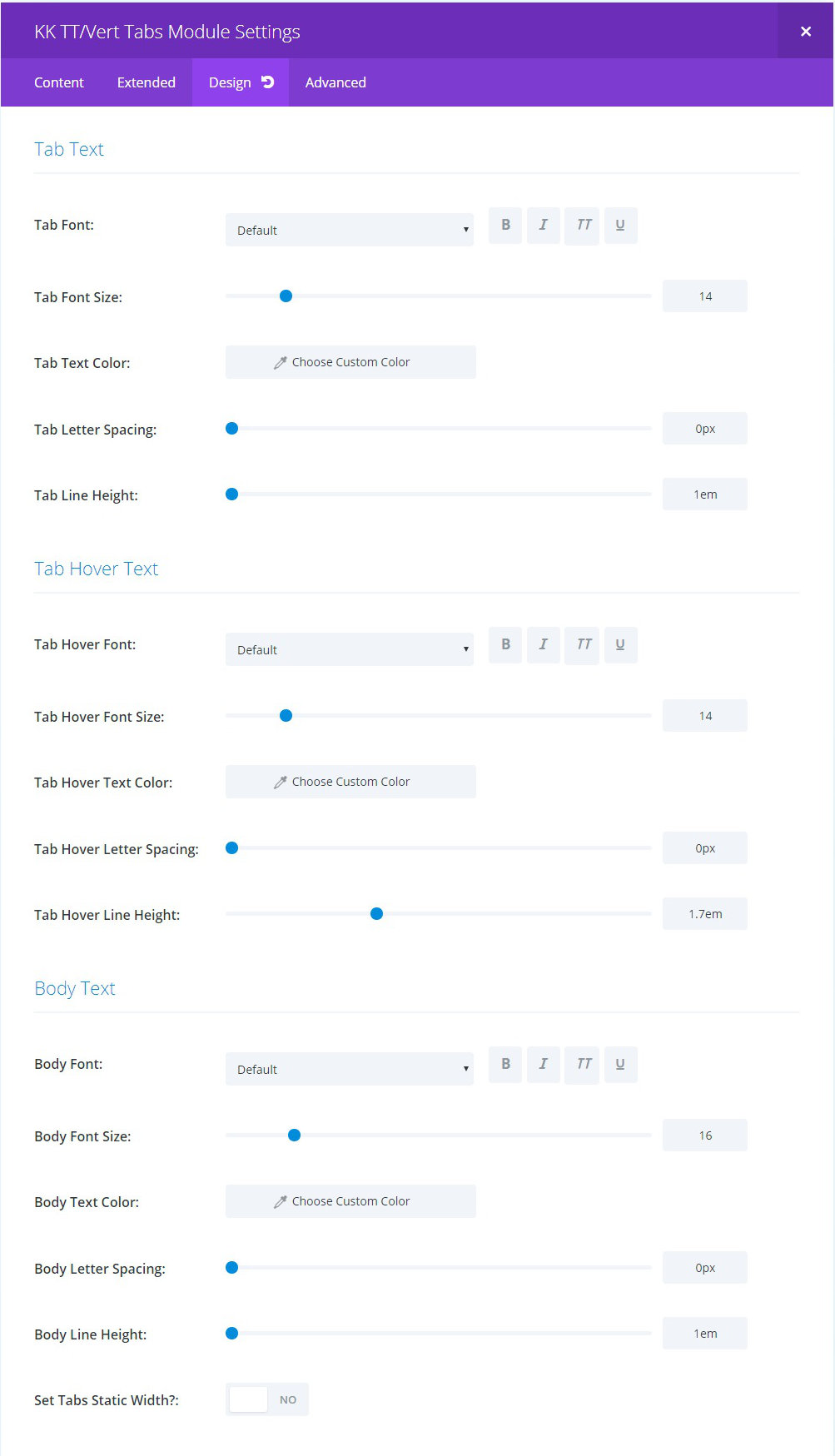
SET TABS STATIC WIDTH?: this toggle, when set to “Yes,” reveals a slider control to set all Tabs to a common width. This can be useful to limit the tab width or to extend it to help avoid title wrapping, etc. You may use finite or responsive units in the values you set.
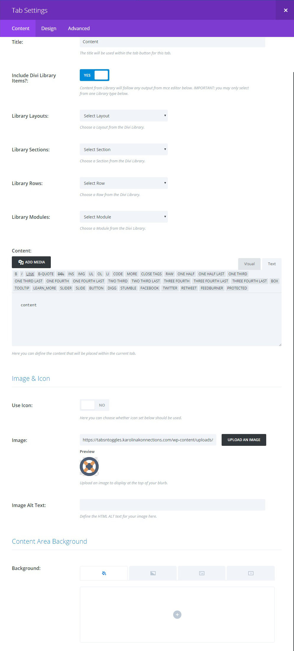
INCLUDE DIVI LIBRARY ITEMS: toggle to reveal or hide select lists from the Divi Library. Only one item from the lists can be chosen. If more than one is chosen, then the one having the greater hierarchy will be used.
CONTENT: optional content that will appear above any Library item.
IMAGE and ICON: depending on the toggle choice, you can choose either a Builder icon or upload/set an image to appear in the Tab. It is important that this styling is consistent in all Tabs. Choosing no Icon or Image will result in no html being generated. Only the Title will display if opted to do so.
BACKGROUND: if used, this control will supersede any common setting.
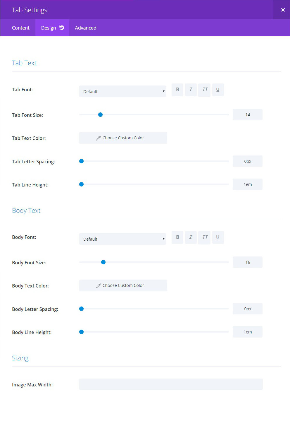
SIZING: this is reserved for future use. This is specific to when Image is selected for including images in the Tabs. It will allow setting a maximum width for any image selected.