Horizontal Tabs

SHOW TITLES: this toggle will turn on/off the display of the Tab Titles. Titles are still necessary to identify them in the list within the settings.  
BACKGROUND: this control is default for the background of the Tab Content Area. This can be over-ridden by setting the content background in the settings for each Tab.
USE BORDER: toggle border On or Off.
EQUALIZE TAB CONTENT HEIGHT: toggle whether all tab content areas should have equal heights. This will be determined by content with the greatest height.
TAB BACKGROUND/HOVER: set the color for the Active and Inactive Tabs or rely on defaults set in the stylesheet. Also as an option, set the Hover color.
TAB CORNERS RADIUS: optionally set the CSS radius of the outside corners of each tab. Default value is 0px.
TAB CONTROLS BACKGROUND COLOR: optionally set the background color of the Tabs container.  This control can also be used to set the value to "transparent."
TABS STATIC WIDTH: toggle setting equal widths for each Tab. "Yes" reveals a slider control.  Finite or responsive CSS (including percentage) units can be used.
TAB HEIGHT/POSITION: these settings are for CSS padding for each side of the Tabs. Optionally set values for different devices.
CONTENT AREA PADDING: these settings are for CSS padding for each side of the Tab Content Area. Optionally set values for different devices.
TAB AND TAB HOVER TEXT: these controls set the default font attributes for Tab text. The “Hover” controls work in concert with the Tab Hover Background Extended settings but are optional.


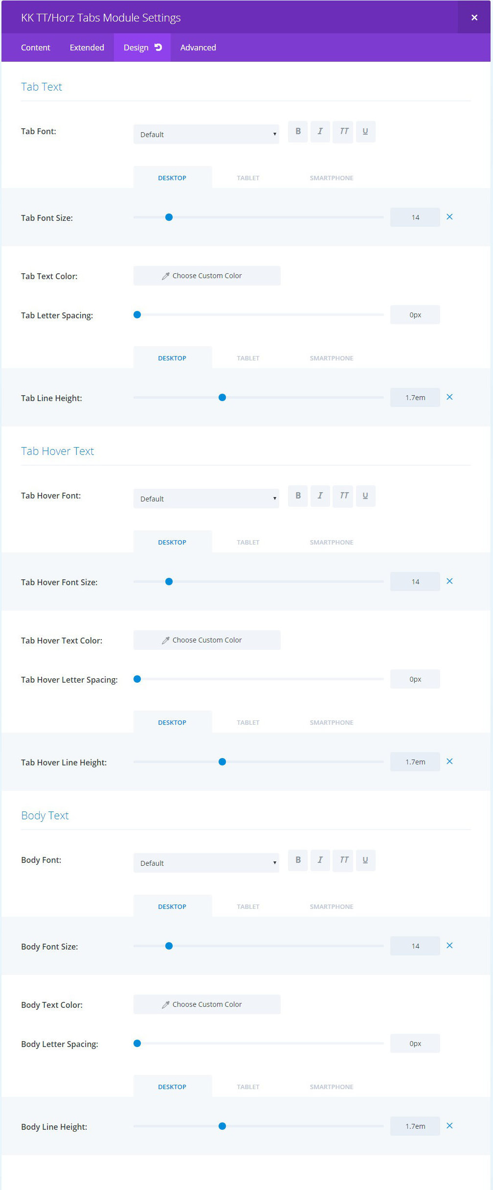
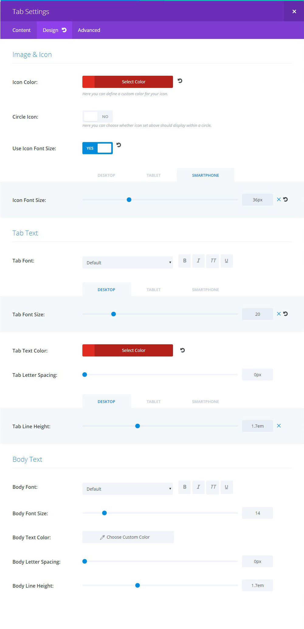
BODY TEXT: these controls set the default font attributes for the Content Area.


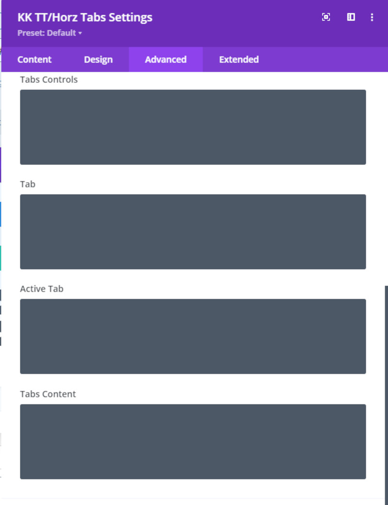
TABS CONTROLS: CSS rules for the Tabs full-width container block.

TAB: CSS rules for each Tab as a group.

ACTIVE TAB: CSS rules for the active tab.

TABS CONTENT: CSS rules for the Tabs Content as a group.

TITLE: textual title for the tab and also serves as the admin label.

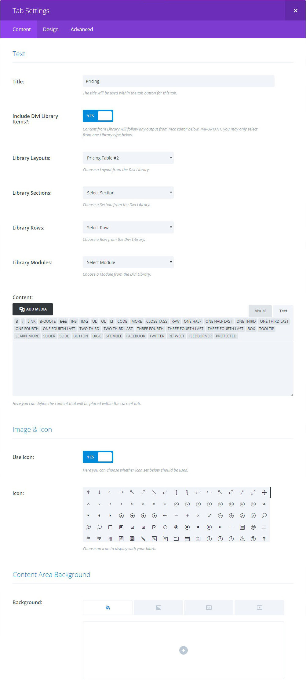
INCLUDE DIVI LIBRARY ITEMS?: toggle enabling inclusion of Divi Library content into the content area for the tab. The Library content will appear below any content input into the tiny-mce below.

LIBRARY SELECTION LISTS: select one item from one list to include as content. If multiple items are selected, the item with the highest level in the hierarchy will be included.

IMAGE and ICON: the Use Icon toggle determines if either an Icon or Image will be included with the Tab Title. “Yes” provides a selection list of Builder icons. Styling of this icon is within the Tab Design tab. “No” will reveal a control to choose an image from the Media library. Leave either the icon or image unchosen to opt not to include.

IMAGE and ICON: if Icon is selected, there are four controls to style the icon. If Image is elected, then there will be a control to establish MAX WIDTH. The latter will be active in the next release.

TAB/BODY TEXT: the font/text controls will override any stylesheet CSS or what may be set in the Design tab for the module.